Hive
Design, Branding and Merchandise for Hive Bank
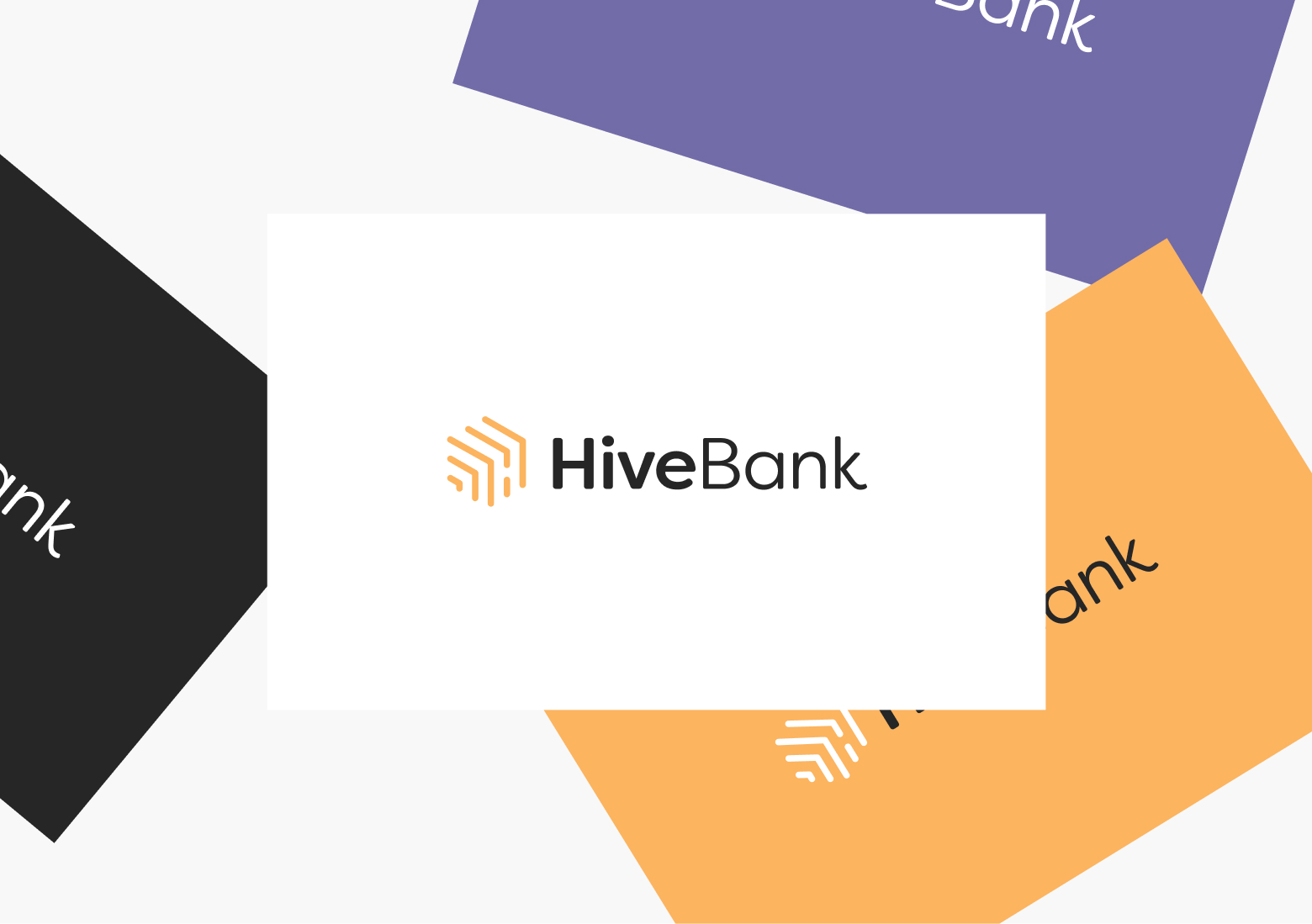
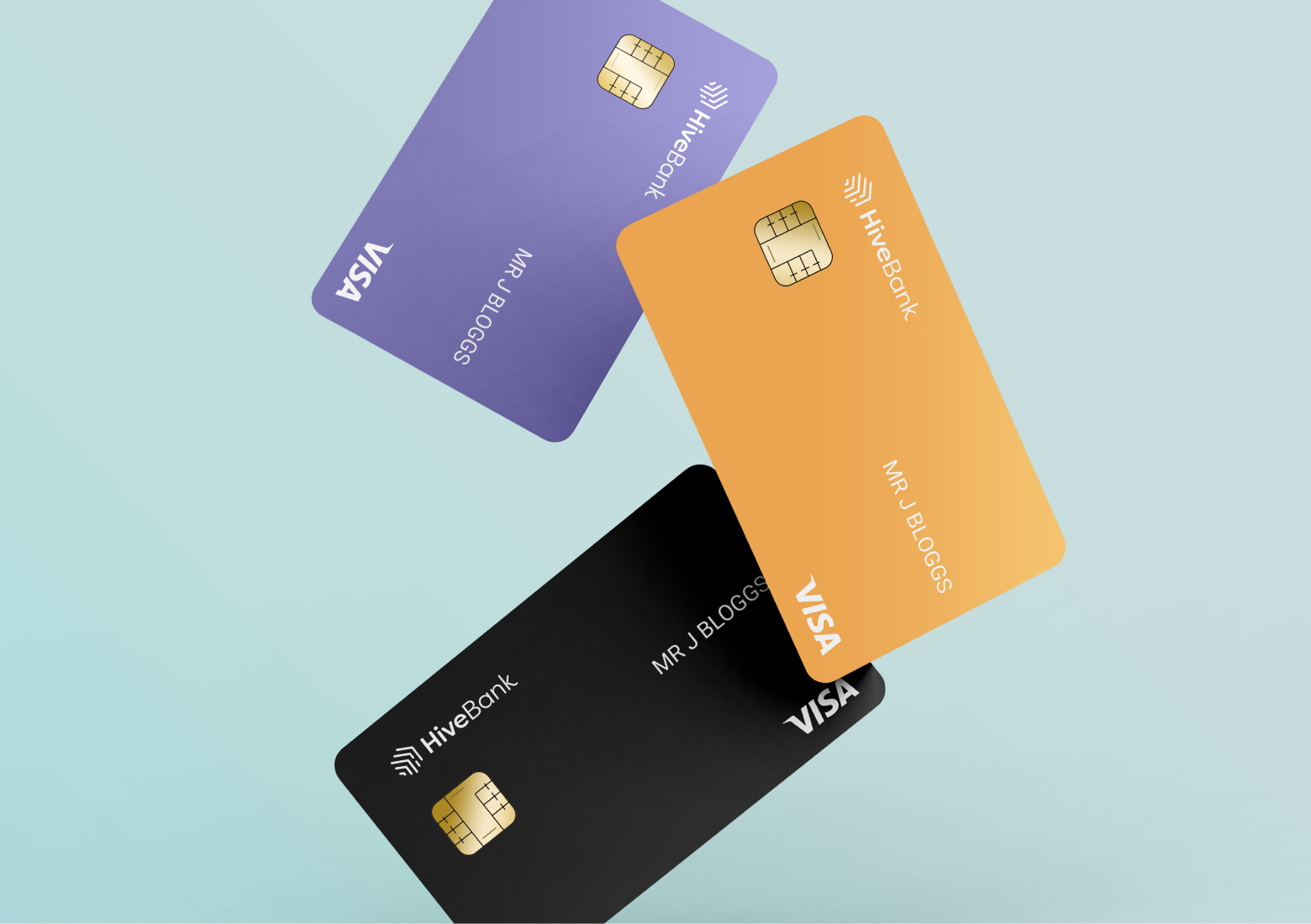
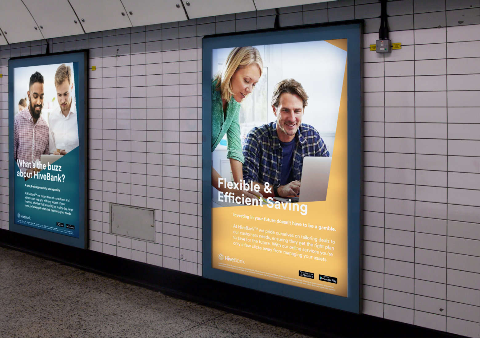
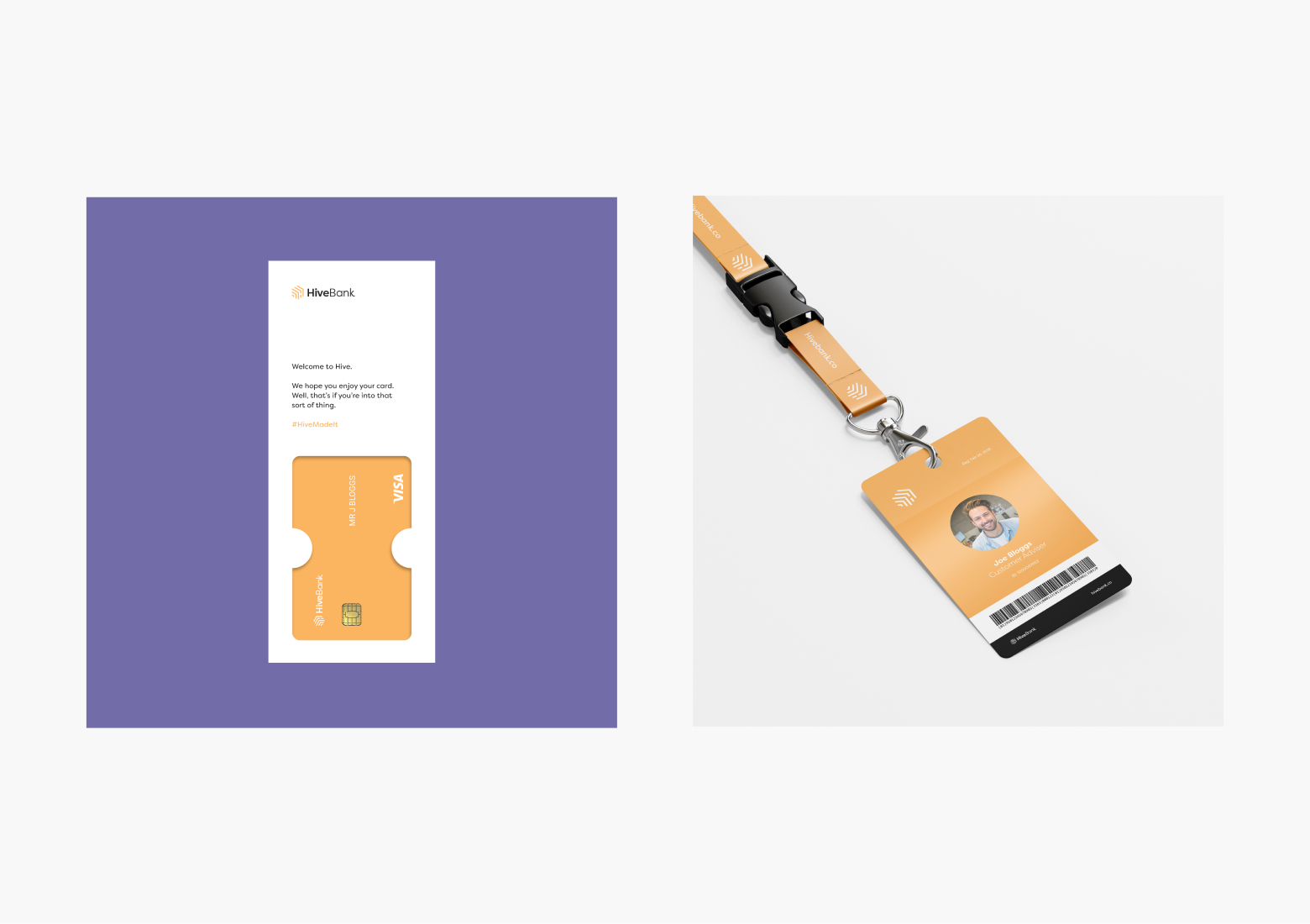
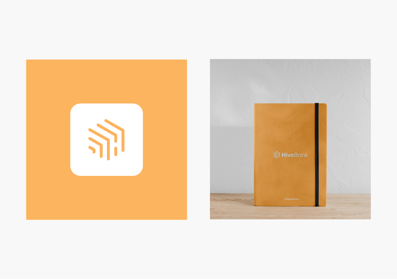
Branding and positioning for HiveBank, a young fin-tech company who are trying to break into the market. A warm colour palette and carefully curated imagery conveying the company's target demographic helped to freshen up their identity which had previously looked fairly cold and corporate.
Full case study available on request.
Business cards
01/06
Meta
Branding & Website UI
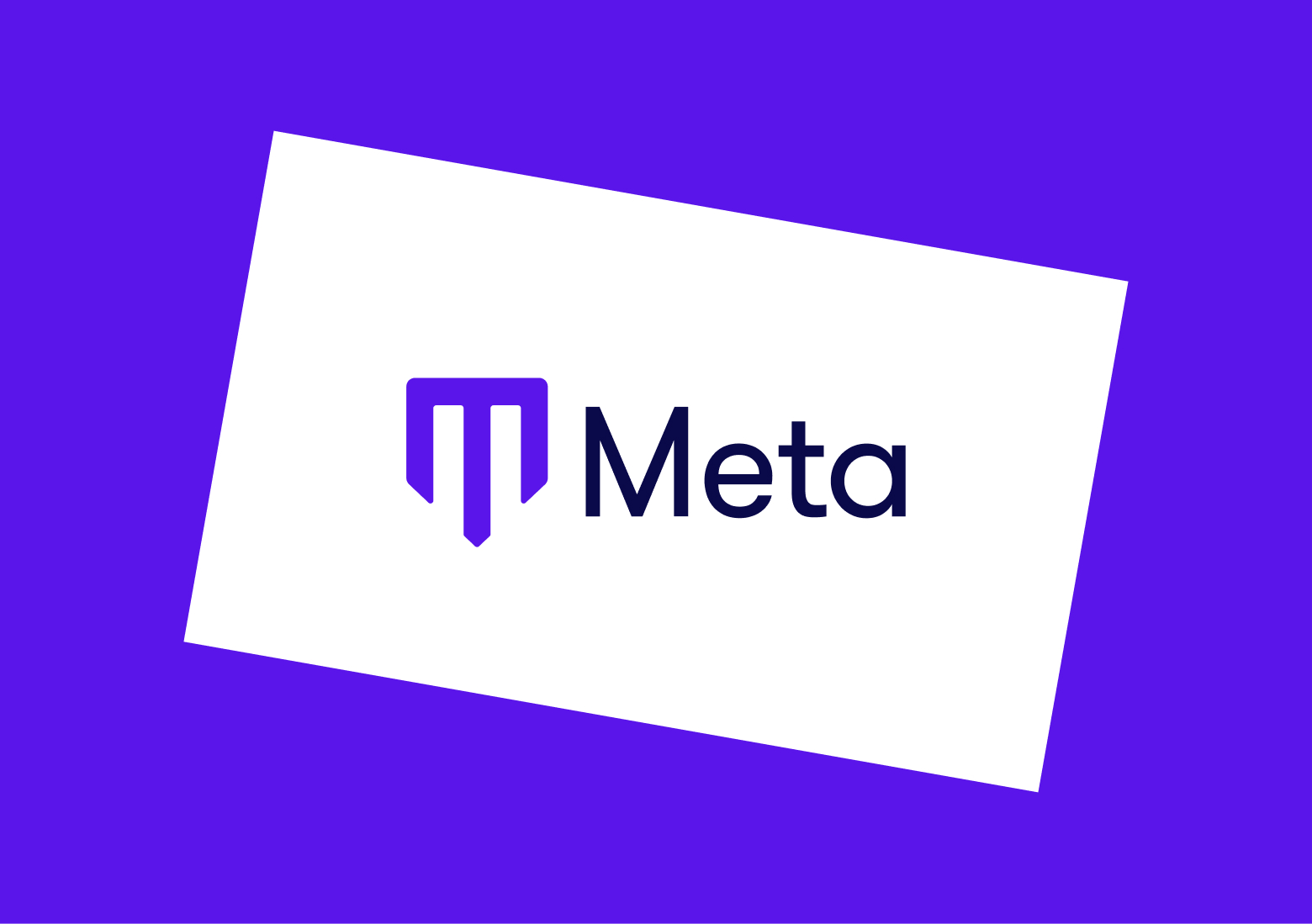
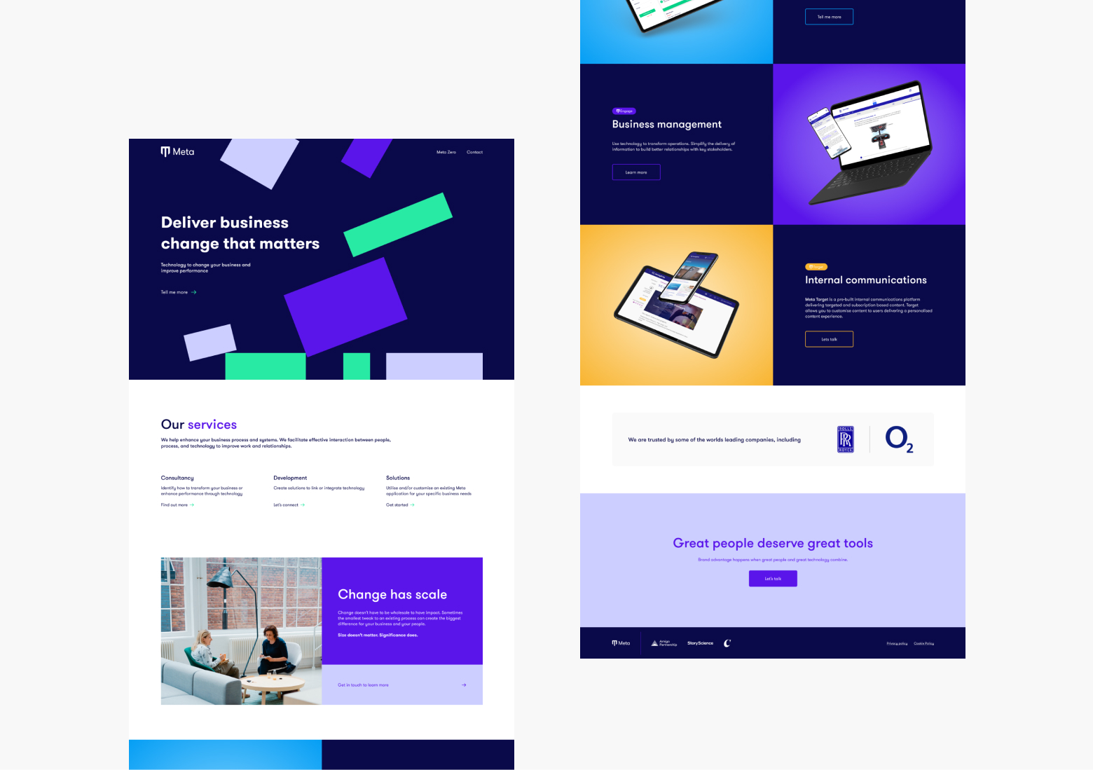
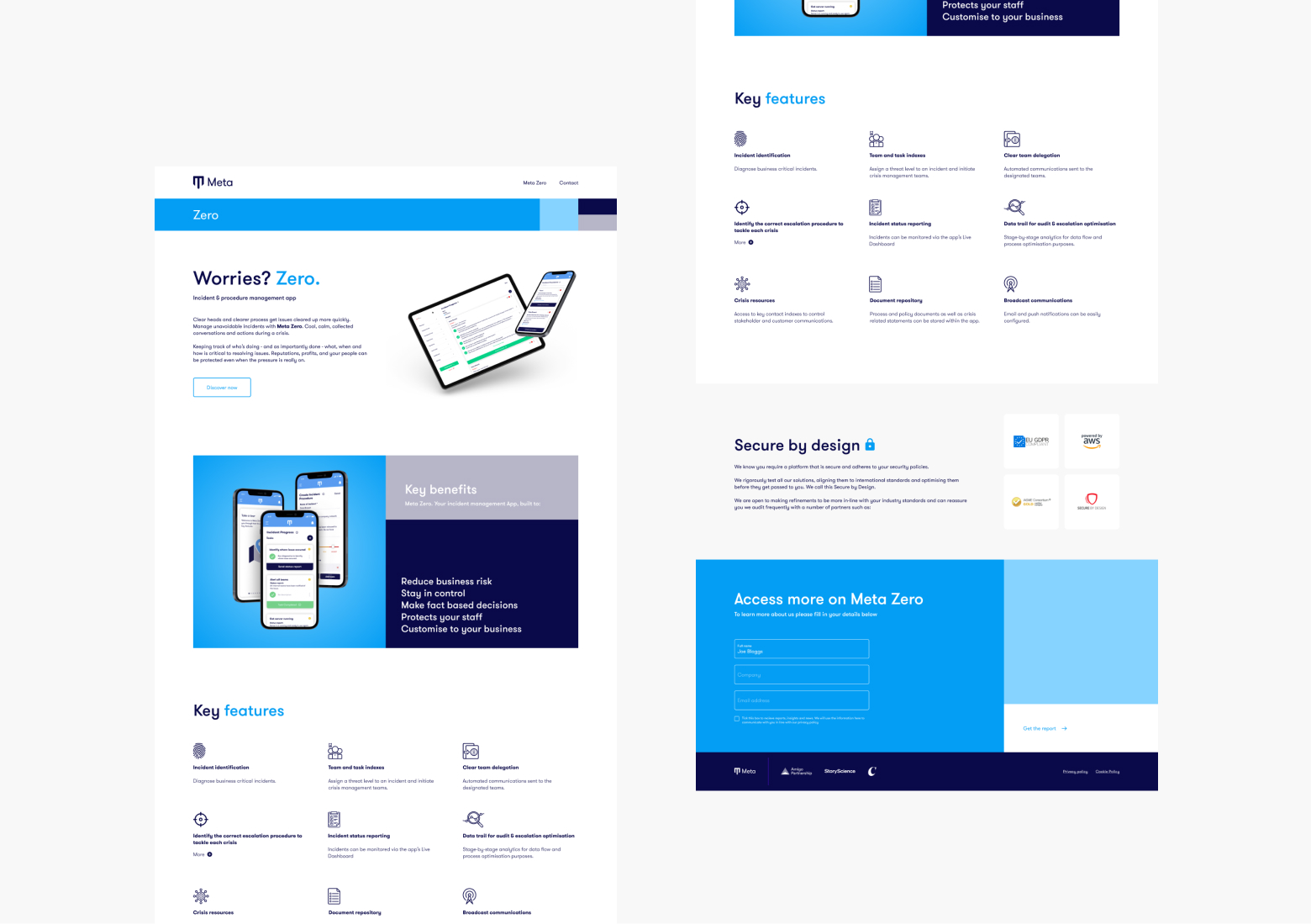
Having had a change of direction, Meta wanted to freshen up their look and feel ahead of the launch of their internal incident response platform, Meta Zero. This was a quick turnaround so after our research, the team and I refreshed the colours, font and ToV in-line with the human-first approach that Meta wanted. This included a more inclusive colour palette to match the app. The brand is built on 4 strong pillars as well as also having 4 individual products, so we decided to give each product it's own distinct colour whilst the main 'Meta' would be a consistent deep blue.
Full case study available on request.
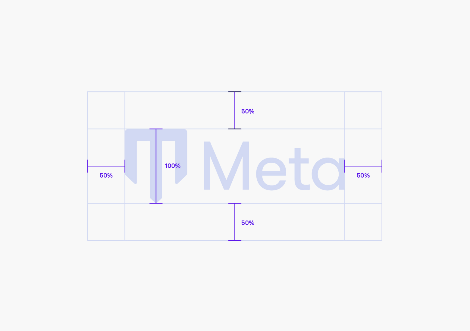
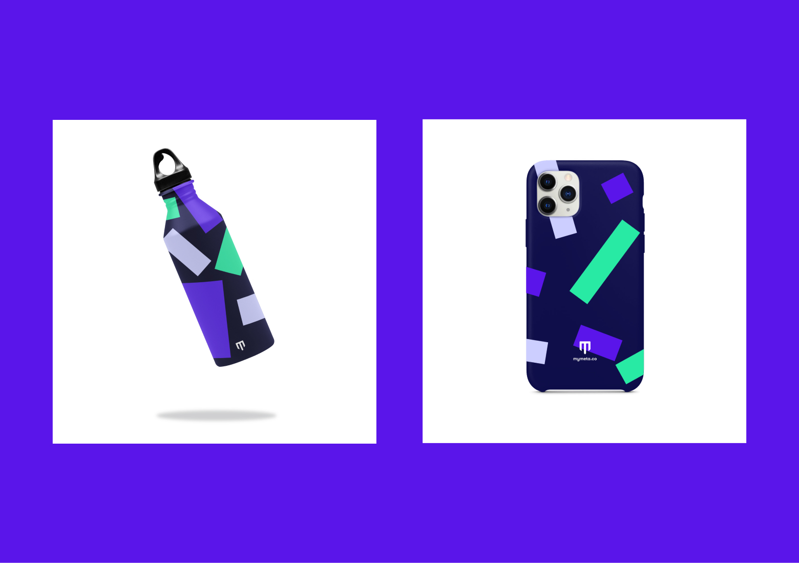
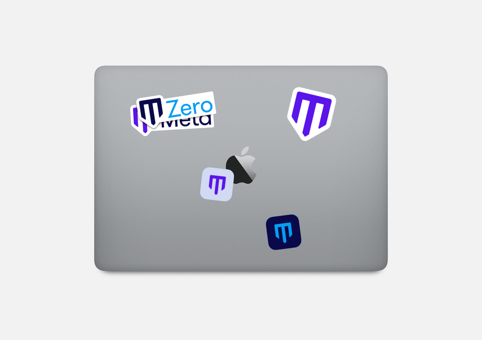
Meta logo
01/06
The Last Dance
Printed publication to accompany the Netflix doc
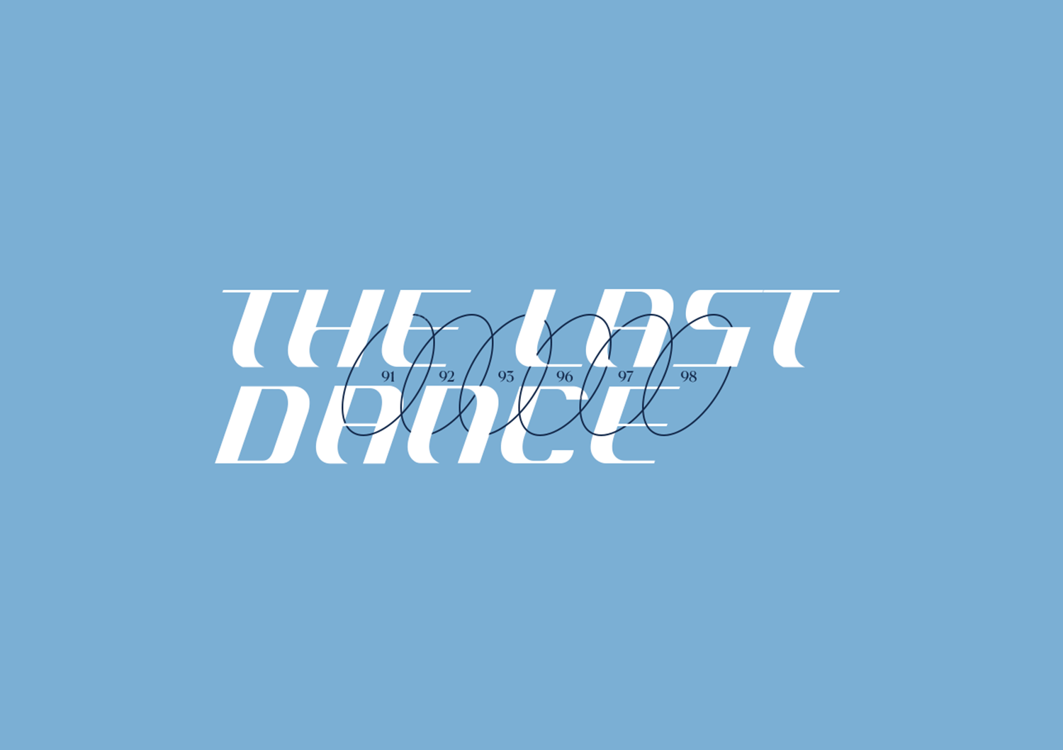
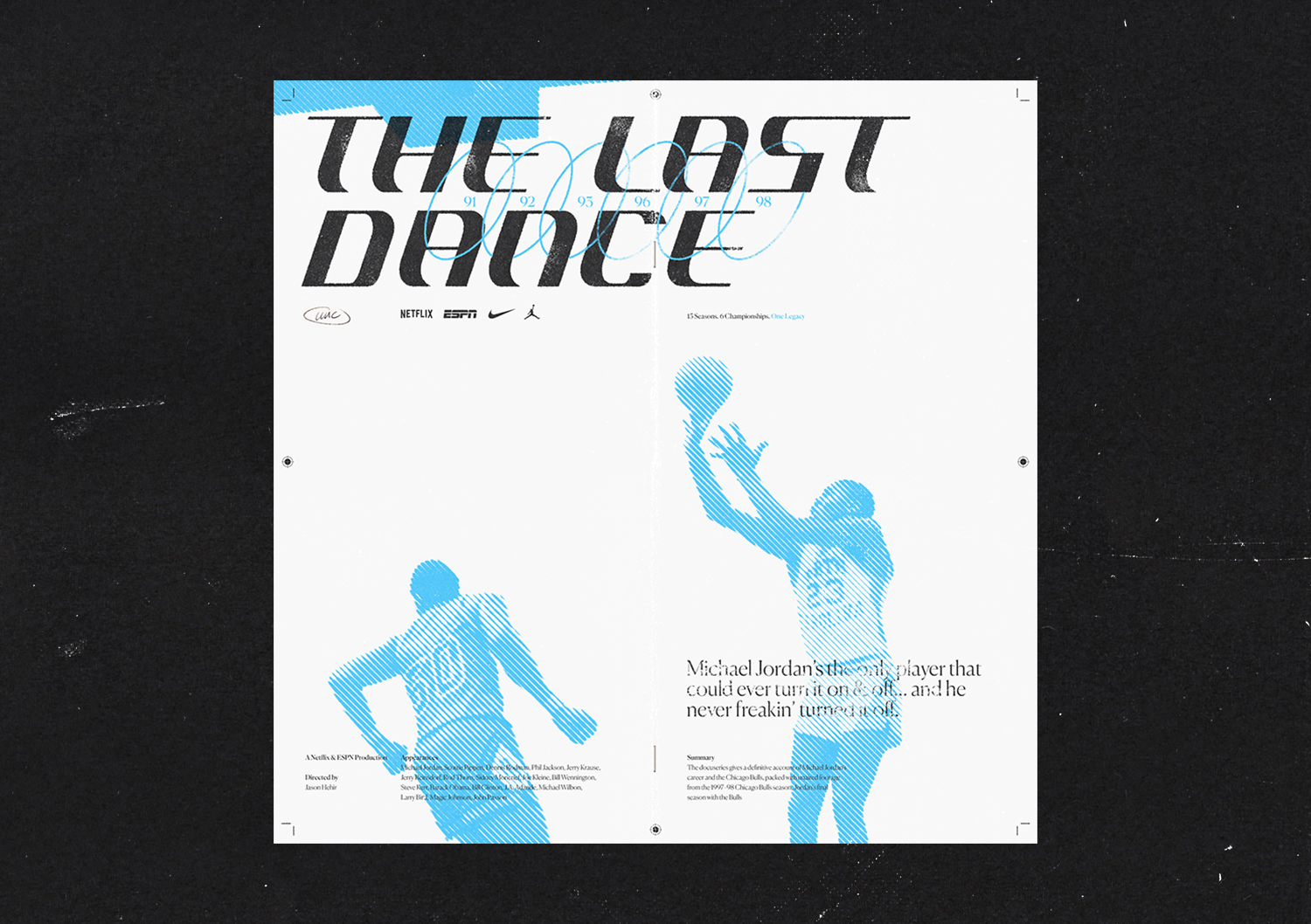
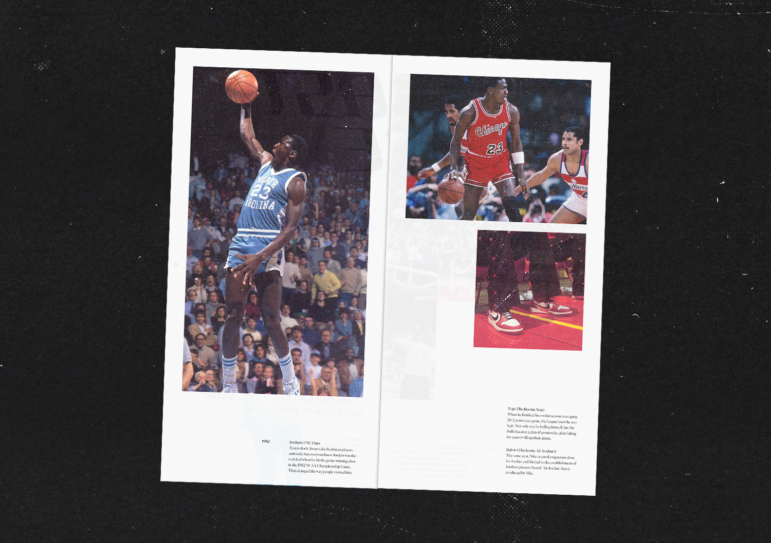
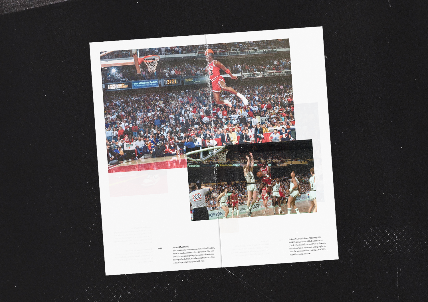
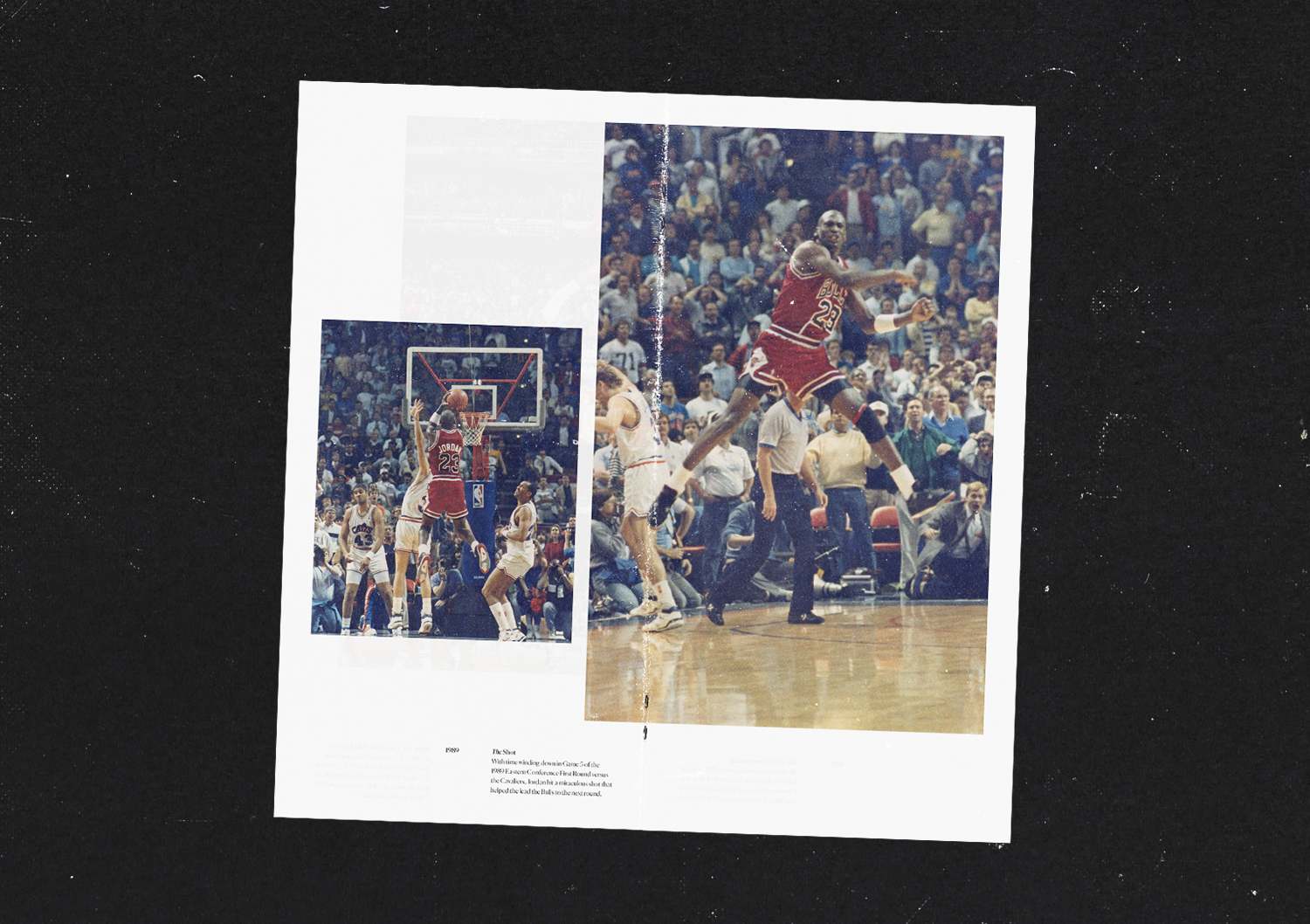
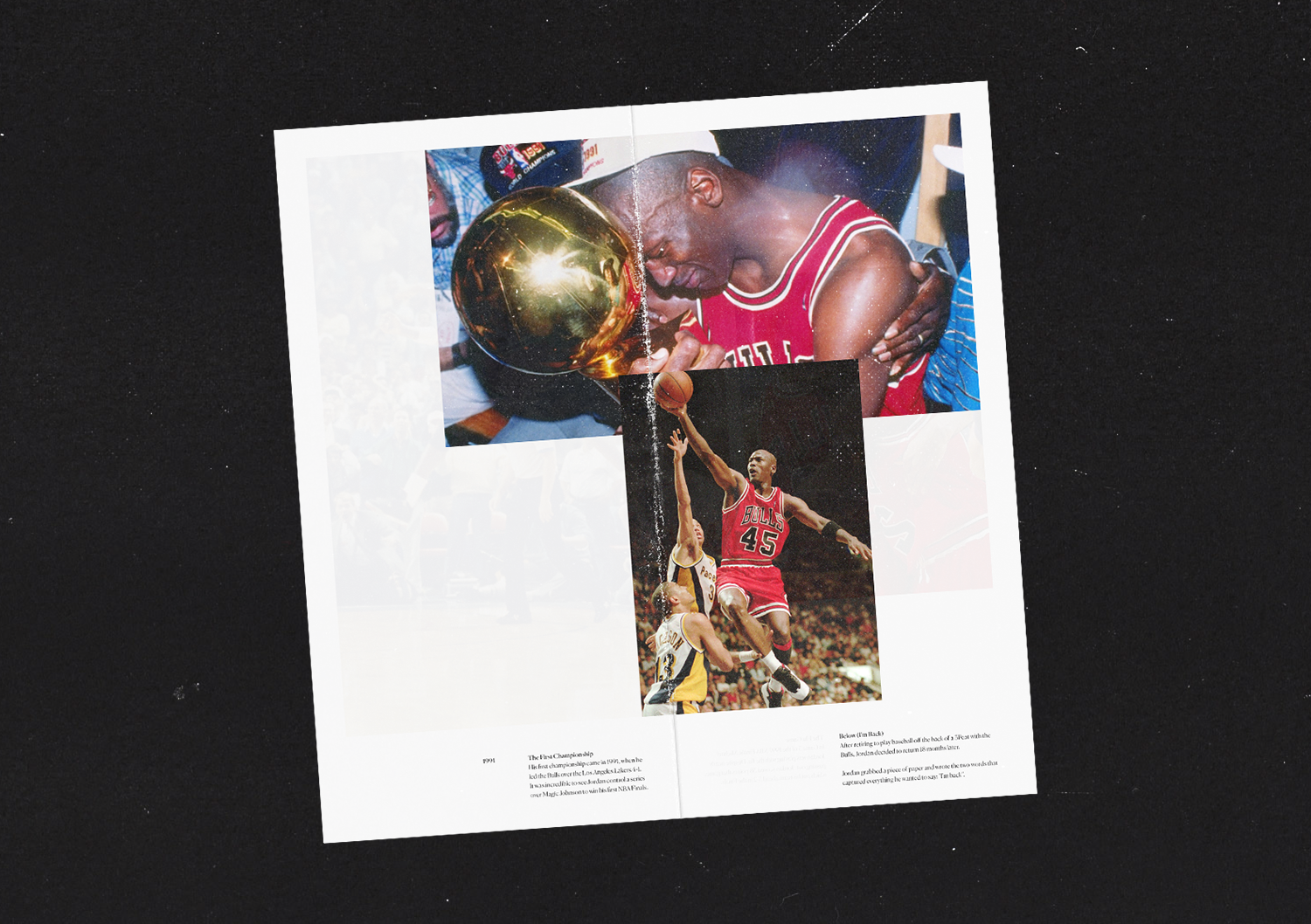
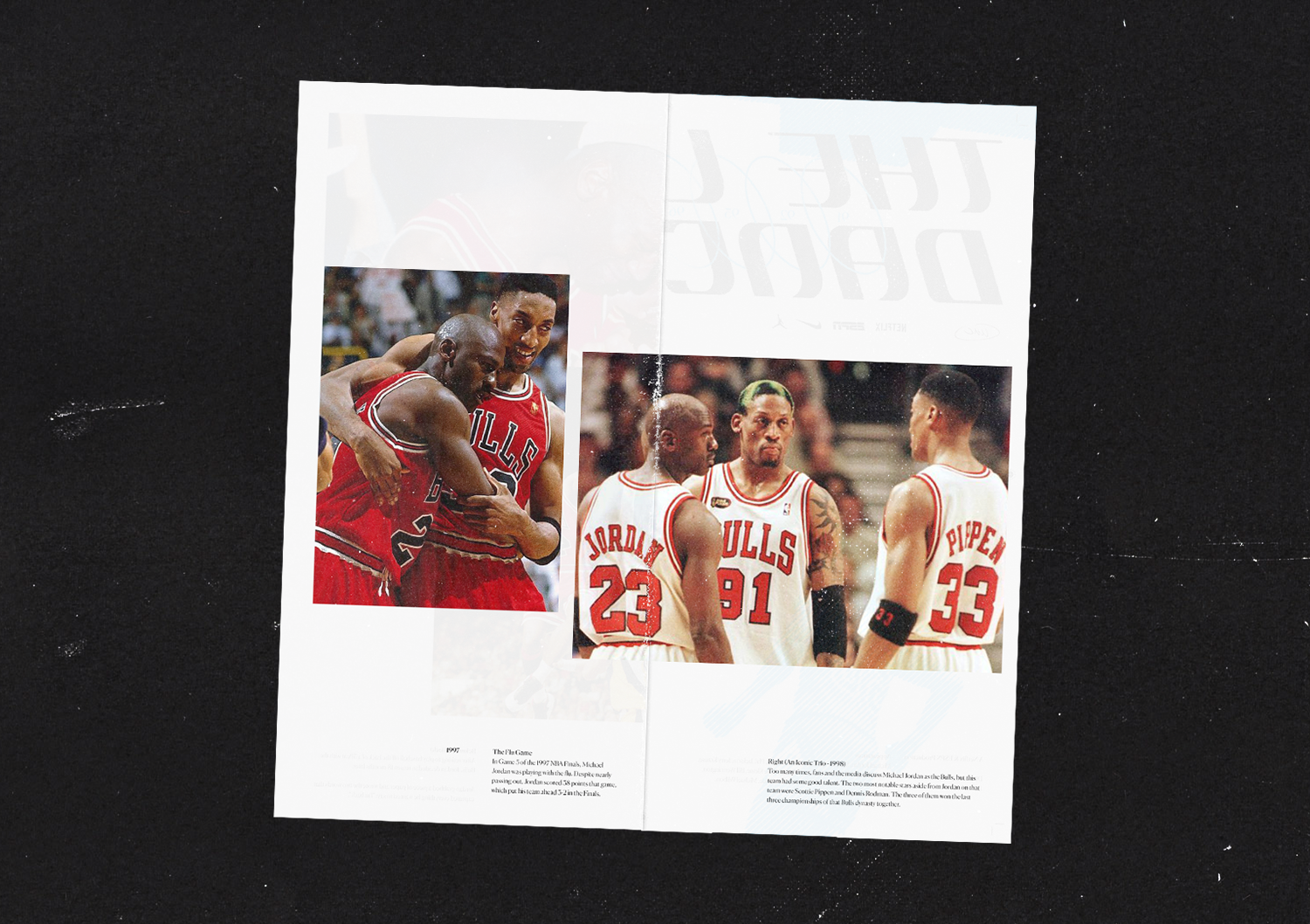
A personal project set up to accompany the series that documented Michael Jordan's career at the Chicago Bulls. I wanted a hand made, 90's inspired cut and paste zine that would document Jordans's career from UNC to the NBA. Image led, the zine highlights key moments from Jordans career as well as nuggets of information that people might not have know about His Airness.
Full case study available on request.
Identity
01/07
GLO
Website UI/UX & brand asset creation
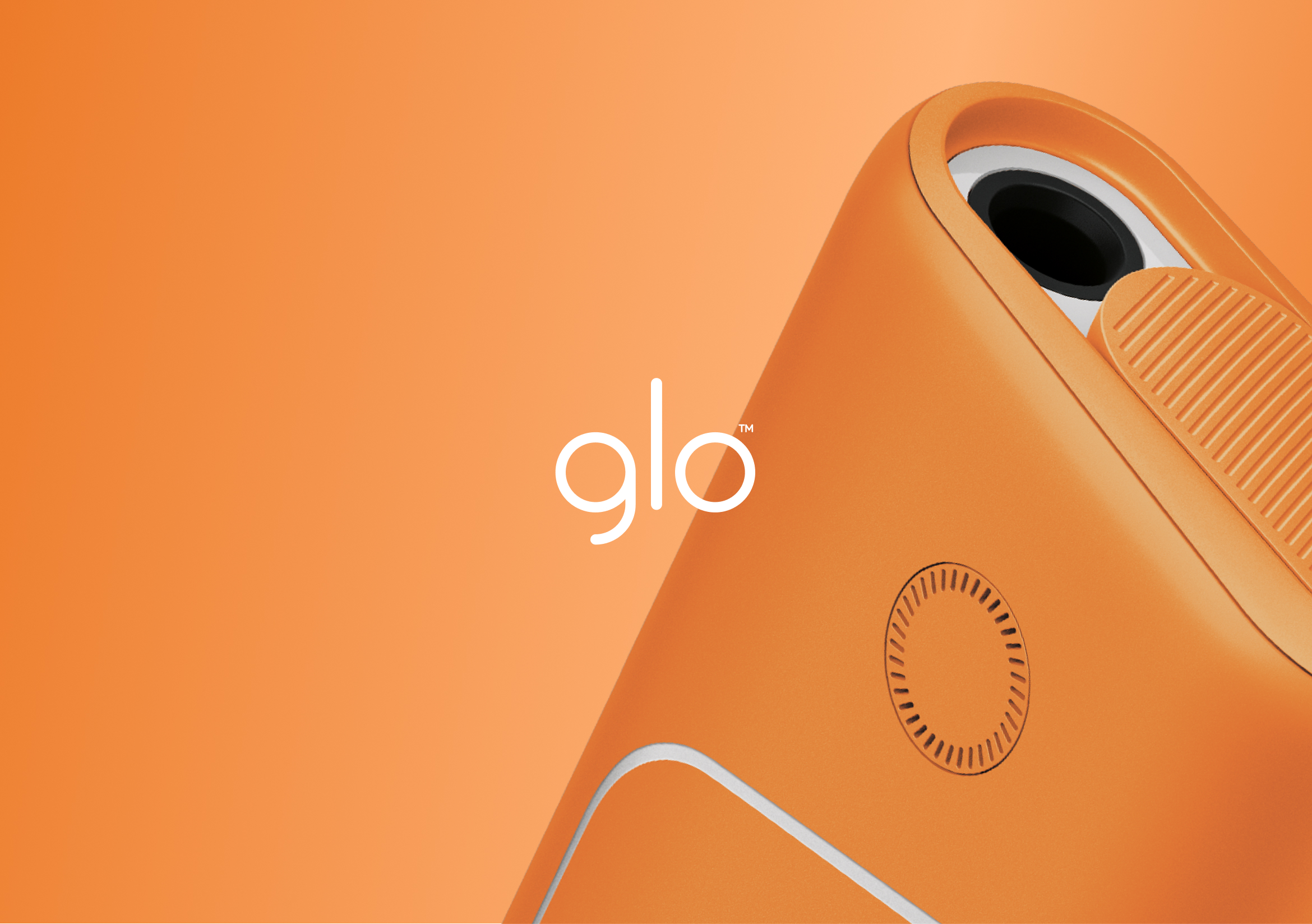
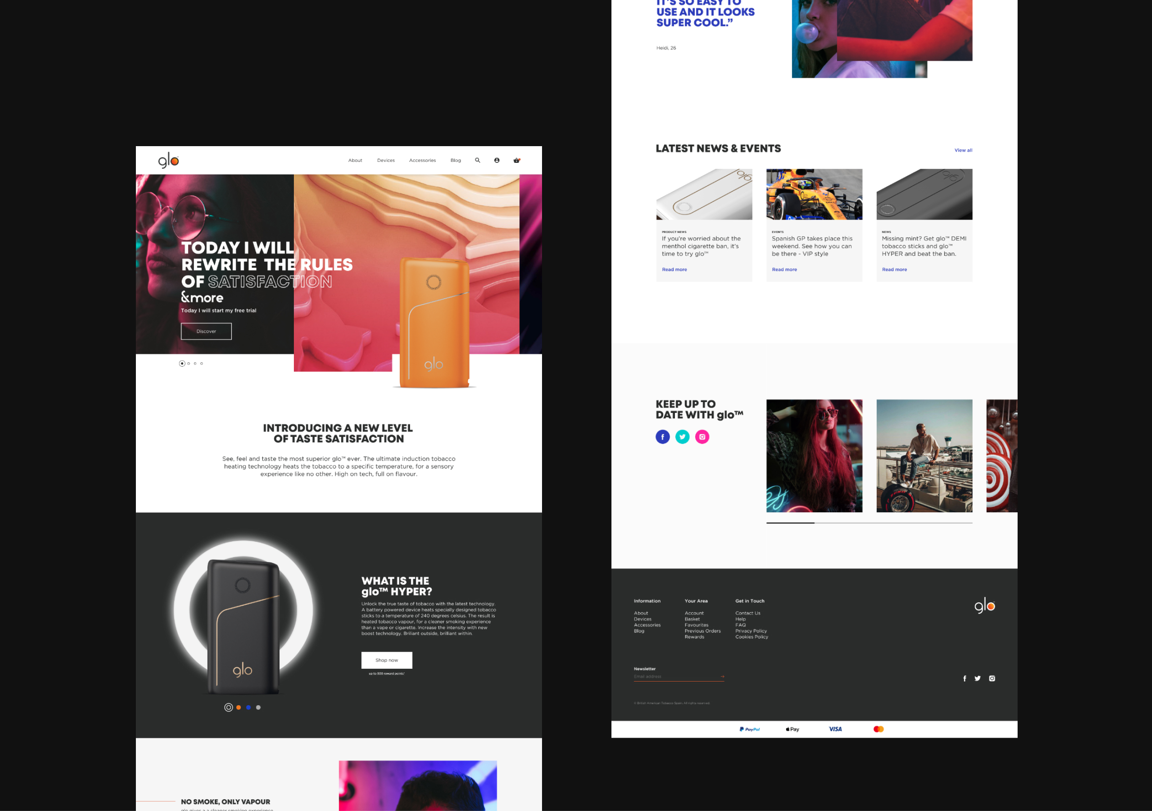
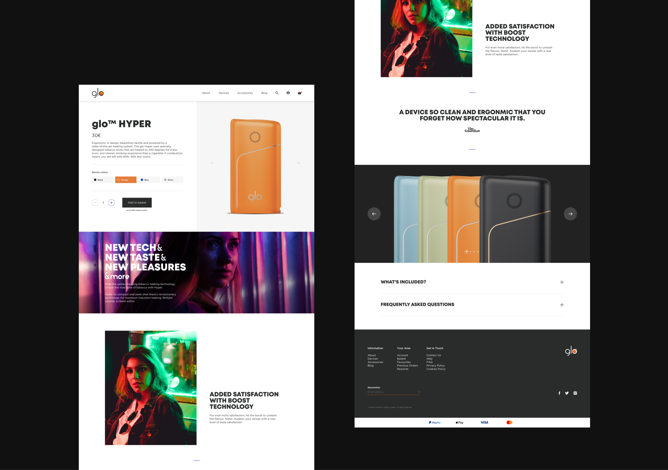
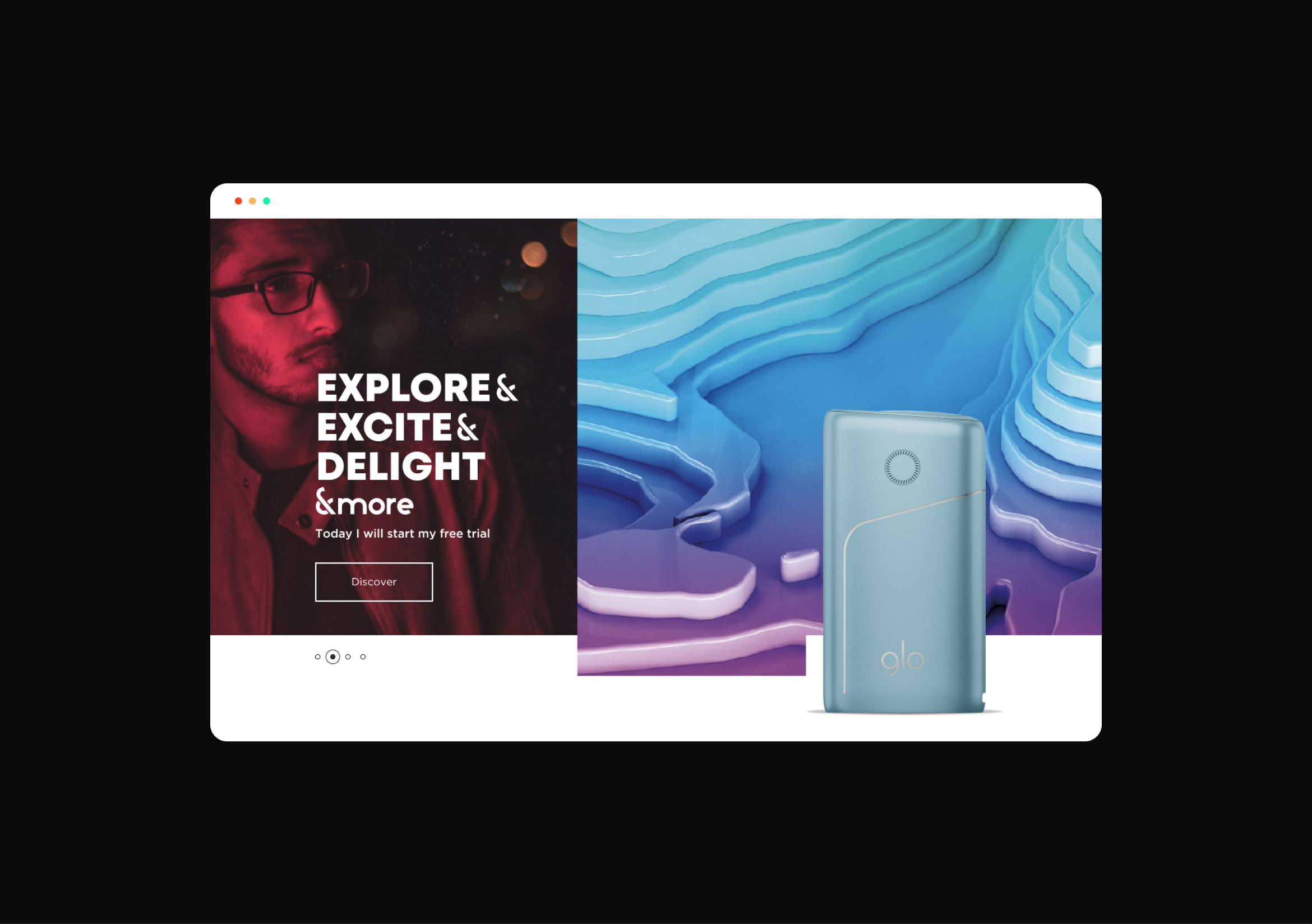
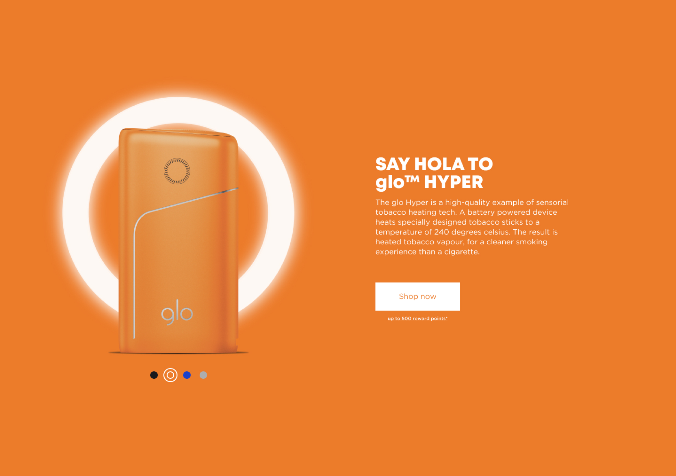
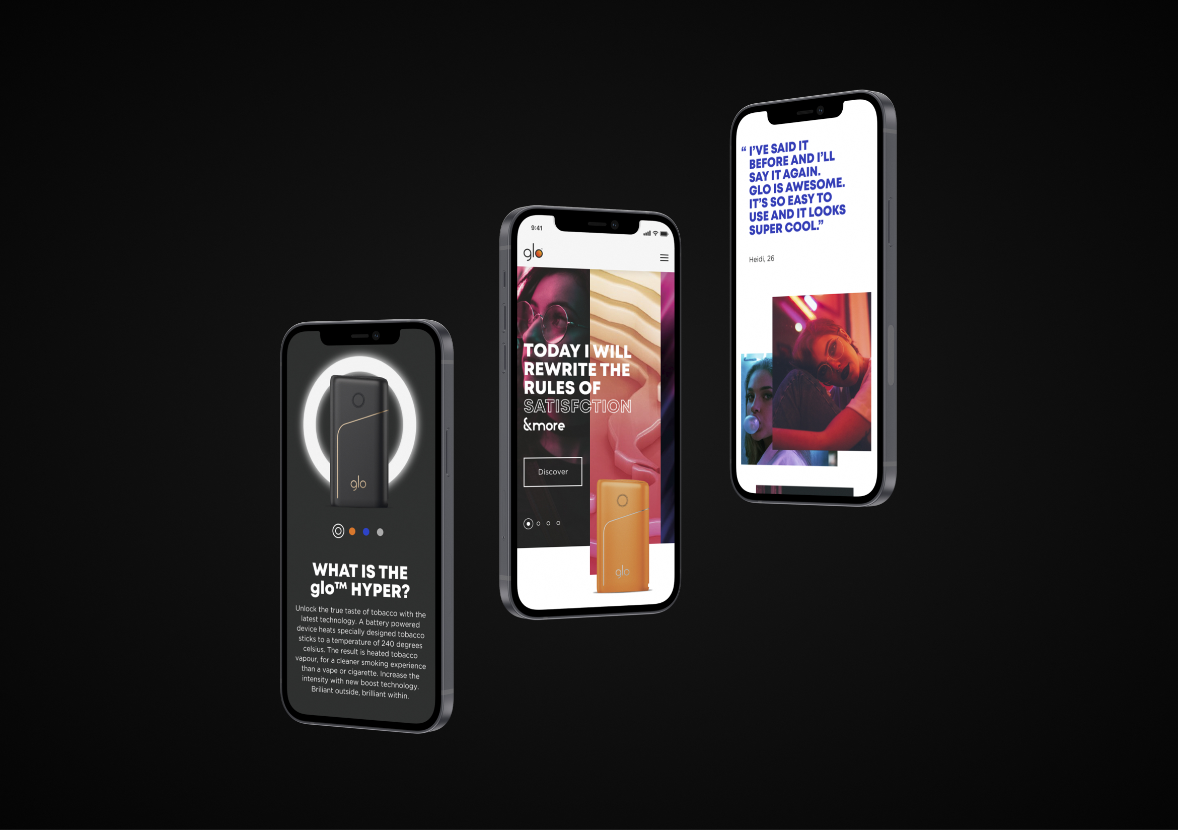
Part of the design team that helped to streamline and freshen up the e-commerce website of GLO, a TH product. A new, simplified click-to-buy feature was introduced to help consumers checkout easily as well as simplifying the SKUs. The brand's key visual was used alongside a new tone of voice to show all of the benefits that the technology could bring to the consumer.
Full case study available on request.
GLO promotional
01/06
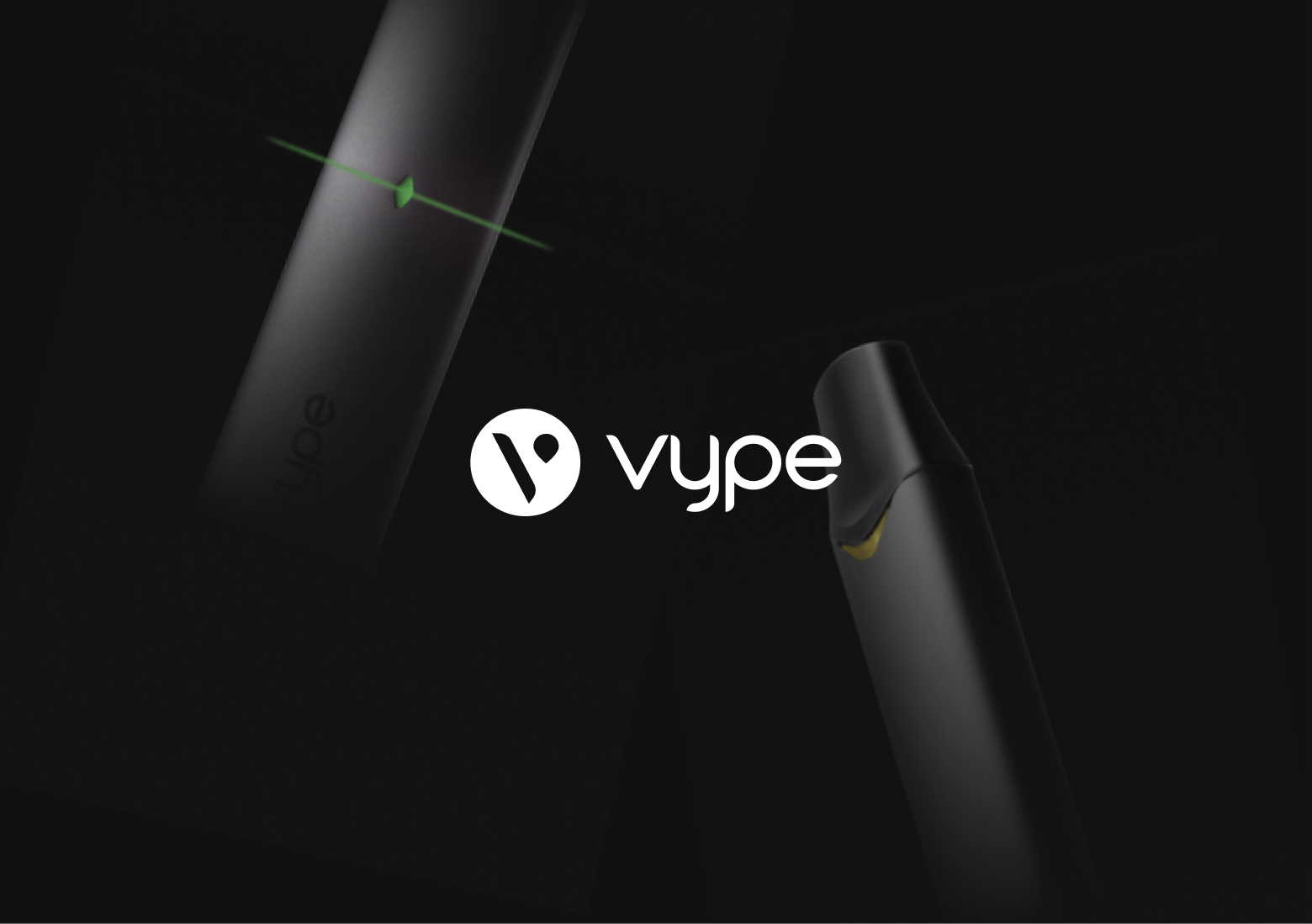
GoVype Website
Website UI/UX & brand application for Vype
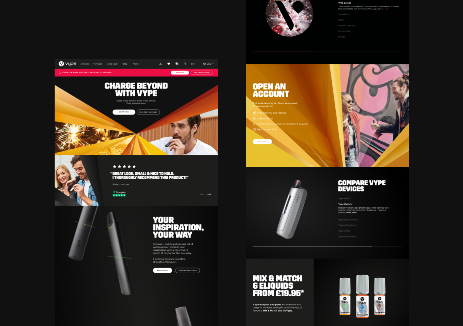
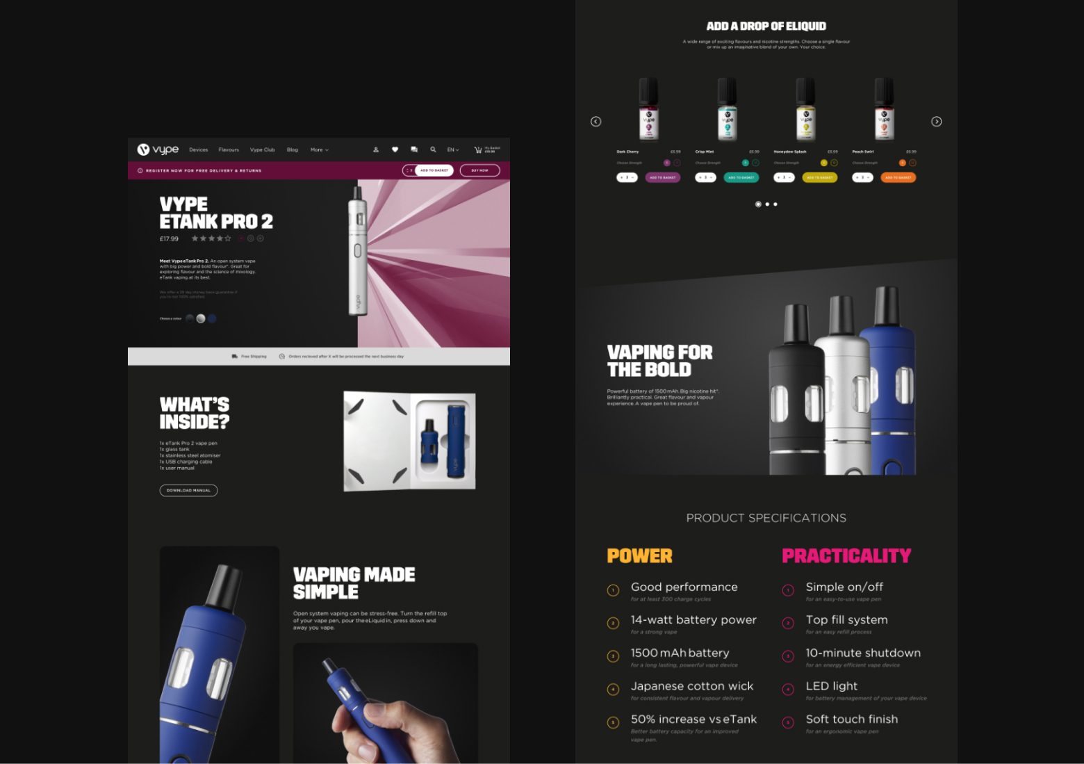
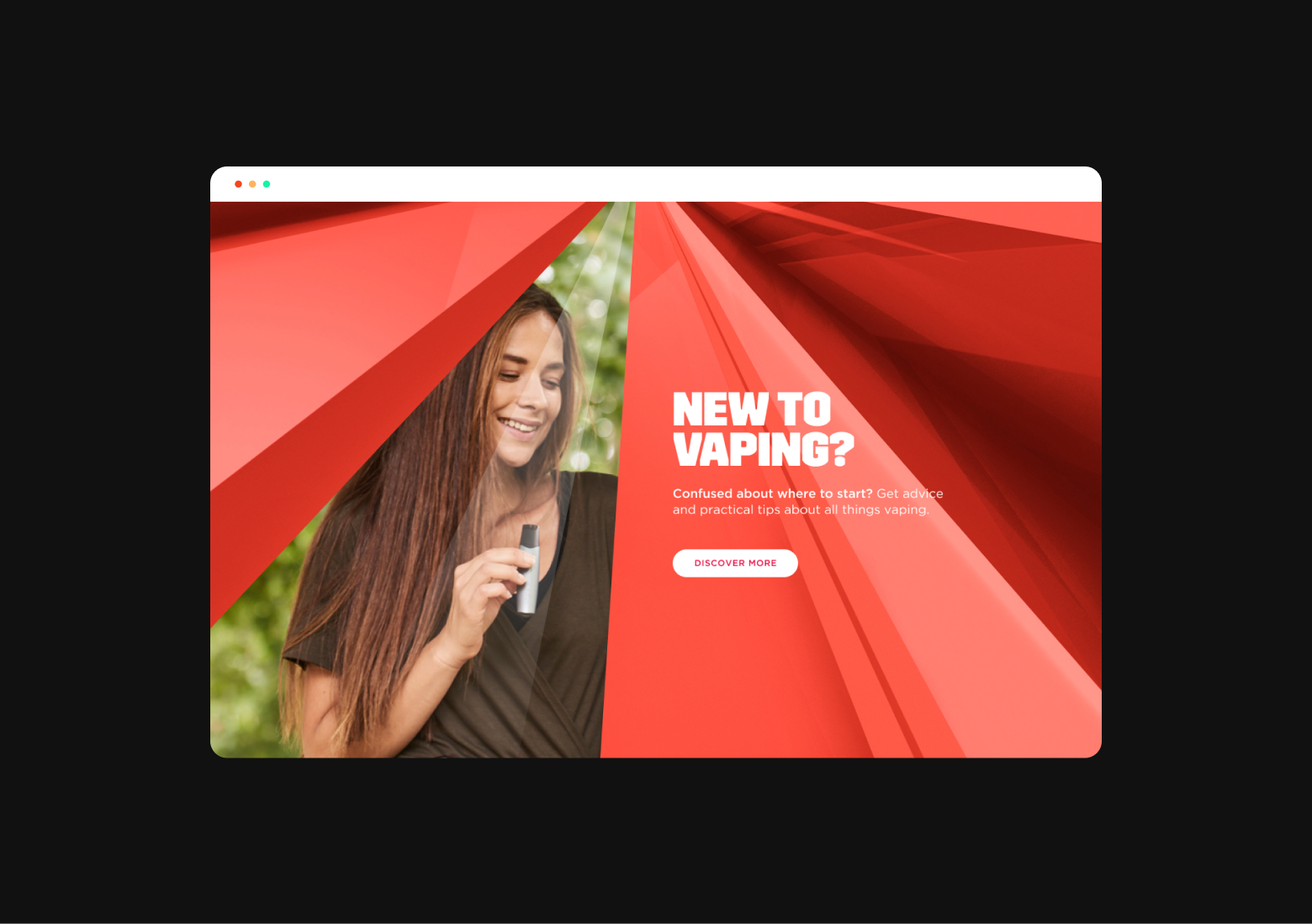
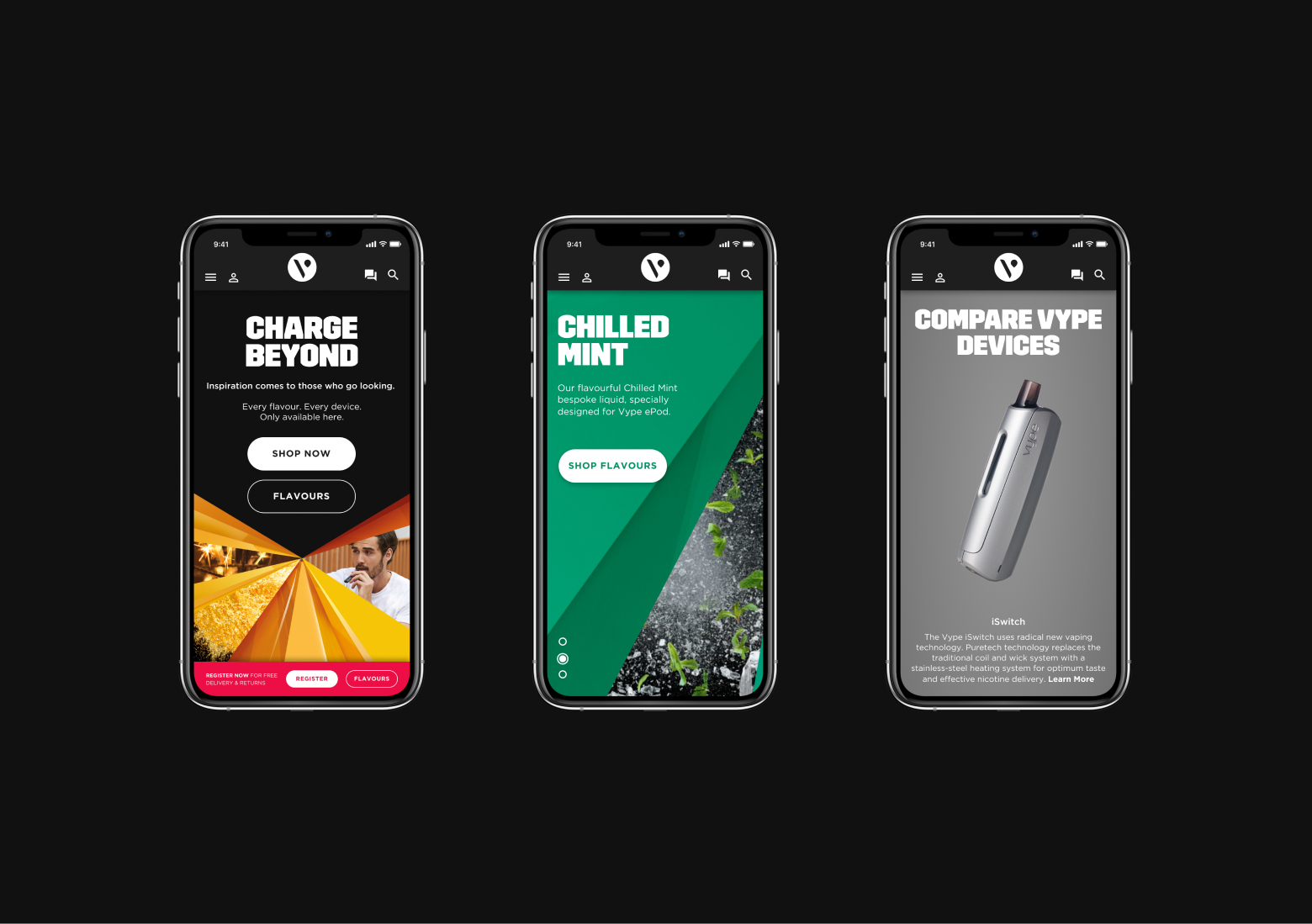
Vype Global eComm Strategy wanted to improve the user experience, elevate the brand and increase sales conversion. The team and I improved the UX by minimising purchase friction, taking out circa 70% of superfluous click layers, incorporating best practice and enhancing product merchandising through UX/design and content.
We worked closely with Wunderman Thomson who were tasked with building the site once the design phase was finished. Since launch conversion rates have increased from 10% to 45%.
Full case study available on request.
Vype Promo
01/05